Teacher Reports for Admins
State/District/School Teacher Summary
Creating a Chart
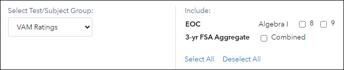 | To create a summary pie chart, select the tested grades and subjects or courses you would like to include. To include all EOC and three-year FSA aggregate VAM ratings, click Select All in the selection area. To include all grades, subjects, courses, and the FSA Aggregate, select VAM components from the Select Test/Subject Group dropdown and click Select All in the selection area. Then click Create New Graph. To view a pie chart for a different set of tests, subjects, or grades, make your selections and click Update Graph. |
Understanding the Report
The results are displayed in a table and a pie chart. The table lists the number of teachers in the selected grades, subjects, and courses in each of the performance levels for the school, district, and state. The pie chart represents the distribution of teachers in the school or district for the selected grades, subjects, and courses. Each pie slice represents one of the performance levels. The color coding matches the colors used in the Teacher value-added reports and is explained in the legend below the table and chart. | 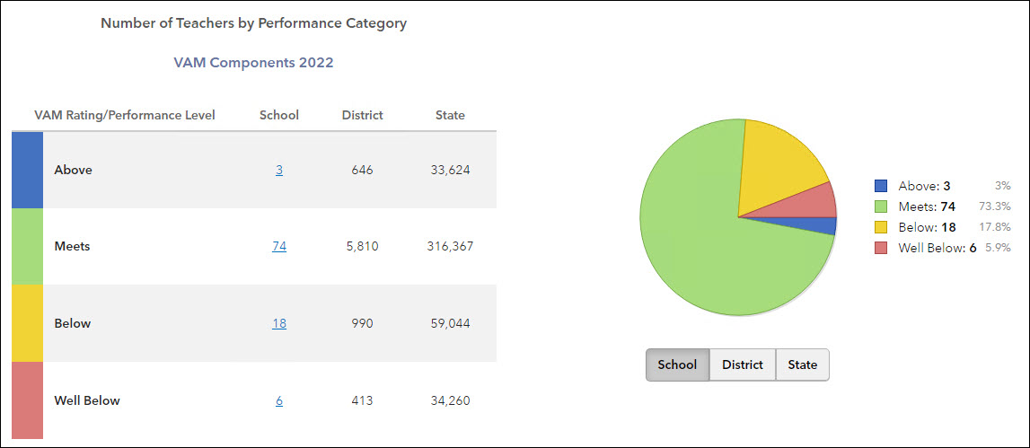 |
If a teacher receives a report at multiple schools, then they will count for both schools regardless of where they taught either class. For example, a teacher teaches grade 6 Math in school A and grade 7 Math in school B. The chart will show this teacher in both school A and B counts. In 2018-19, 537 teachers received measures at more than one school and counted twice on both school distributions. Of these teachers, 129 crossed district lines and counted twice on both district distributions.
The size of each pie slice indicates the percentage of teacher growth indexes in the school or district with that performance level. Position your mouse pointer over a pie slice or the corresponding row in the table to see the percentage.
To see the pie chart for the district or state, choose from the buttons below the pie chart.
Exercise caution when sharing these pie charts, especially when the number of teachers in a grade and subject or course is very small.
Viewing the Teacher Reports
To view the list of teachers in any performance level group, click on the underlined value in the table. The teachers are listed alphabetically by last name. Other columns display the test, subject, and grade (when applicable). Teachers can appear in the list multiple times, once for each grade and subject or course.
To sort the list by any column, click on the column heading.
To view a Teacher Value-Added report for a specific grade and subject or course, click on the teacher's name in the corresponding row.